Jordanna Morgan (![[personal profile]](https://www.dreamwidth.org/img/silk/identity/user.png) jordannamorgan) wrote in
jordannamorgan) wrote in ![[community profile]](https://www.dreamwidth.org/img/silk/identity/community.png) wolfbane_icons2007-08-19 10:28 pm
wolfbane_icons2007-08-19 10:28 pm
Entry tags:
Fourteen Lon Chaney Icons
Due to the ridiculous number of icons I've made already this month, I'm adjusting my posting policy a little. From now on, if I have at least a dozen icons of a particular person/subject, I will post them separately from my monthly hodgepodge. This will ease the overcrowding in my "pending icons" folder. *g*
First to meet that dozen-icon criteria is the great Lon Chaney--arguably the first genuine classic horror star.
Please comment and credit. Do not alter without permission. Do not hotlink.
These were interesting icons to make. Some random commentary:
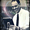
#1: Sometimes the simplest approach is the best (or a picture just speaks for itself). I did very little with this icon besides the text, yet it's one of my favorites in the lot.
#2: Even I find myself reacting to this picture with a slight "Rowr". Ever notice how guys back then could be muscular without being big slabs of beef? *siiigh*...
#3: Another simple-looking icon, although I had a minor battle with the text. The sharp, high-contrast image was too interesting to clutter with needless texturing.
#4: My least favorite of the batch. I made it solely as an excuse to play with the lantern lighting--but I didn't know what to do with it after that, and it shows.
#5-6: Two variations on a theme, using window-shadow textures from![[livejournal.com profile]](https://www.dreamwidth.org/img/external/lj-userinfo.gif) meleada. I like these; they look to me like very modern movie posters.
meleada. I like these; they look to me like very modern movie posters.
#7: That is the most prolific shot found in image searches for Chaney--but it's my favorite icon here, nonetheless. I couldn't resist sneaking in another cross-shaped shadow, because the old Opera Ghost looks awfully like a vampire to me. (This icon won second place at![[livejournal.com profile]](https://www.dreamwidth.org/img/external/lj-community.gif) classicicontest.)
classicicontest.)
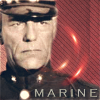
#8: Eh on this one. I won't be surprised if someone jumps in to tell me that isn't actually a Marine uniform, although I seem to recall one of Chaney's more lauded roles being a hard-bitten Marine sergeant.
#9: It's hard to tell, but Chaney is trying on a set of fangy teeth in that shot. The interesting blue-green two-tone is actually the picture's original coloring as I found it.
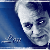
#10: Something understated. Chaney does have a fascinating face--and what a peculiarly winsome expression. I quite like this.
#11: Off-topic question: does anyone know a more proper name for that "newsie" type of hat? It gives me great glee when James Cagney wears them. *g*
#12: Chaney with his makeup kit. (I did not colorize this.) The picture makes me think Cagney wasn't such an odd choice to play Chaney, after all; here Lon remarkably displays almost the same wolfish, looking-up-from-under-the-brows grin that was so distinctive to Jimmy.
#13: Something a bit silly, really. I made these last two a couple of days after the first dozen, and I wasn't quite as inspired then.
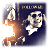
#14: A different view of the Phantom.
Coming soon: two more single-subject icon posts featuring Cary Grant and X-Men, once a couple of current icontests have concluded.
I might also add that I've just become a co-moderator atx_men_stills, the X-Men movieverse icontest. My first challenge there will be posted tonight. Wish me luck! *g*
If you enjoy my work and would like to show appreciation for it, I welcome tips in the form of Dreamwidth Points. (Enter my username "jordannamorgan" as the account you're buying for.)
First to meet that dozen-icon criteria is the great Lon Chaney--arguably the first genuine classic horror star.
Please comment and credit. Do not alter without permission. Do not hotlink.
| 1 | 2 | 3 | 4 | 5 |
 |
 |
 |
 |
 |
| 6 | 7 | 8 | 9 | 10 |
 |
 |
 |
 |
 |
| 11 | 12 | 13 | 14 | |
 |
 |
 |
 |
These were interesting icons to make. Some random commentary:
#1: Sometimes the simplest approach is the best (or a picture just speaks for itself). I did very little with this icon besides the text, yet it's one of my favorites in the lot.
#2: Even I find myself reacting to this picture with a slight "Rowr". Ever notice how guys back then could be muscular without being big slabs of beef? *siiigh*...
#3: Another simple-looking icon, although I had a minor battle with the text. The sharp, high-contrast image was too interesting to clutter with needless texturing.
#4: My least favorite of the batch. I made it solely as an excuse to play with the lantern lighting--but I didn't know what to do with it after that, and it shows.
#5-6: Two variations on a theme, using window-shadow textures from
#7: That is the most prolific shot found in image searches for Chaney--but it's my favorite icon here, nonetheless. I couldn't resist sneaking in another cross-shaped shadow, because the old Opera Ghost looks awfully like a vampire to me. (This icon won second place at
#8: Eh on this one. I won't be surprised if someone jumps in to tell me that isn't actually a Marine uniform, although I seem to recall one of Chaney's more lauded roles being a hard-bitten Marine sergeant.
#9: It's hard to tell, but Chaney is trying on a set of fangy teeth in that shot. The interesting blue-green two-tone is actually the picture's original coloring as I found it.
#10: Something understated. Chaney does have a fascinating face--and what a peculiarly winsome expression. I quite like this.
#11: Off-topic question: does anyone know a more proper name for that "newsie" type of hat? It gives me great glee when James Cagney wears them. *g*
#12: Chaney with his makeup kit. (I did not colorize this.) The picture makes me think Cagney wasn't such an odd choice to play Chaney, after all; here Lon remarkably displays almost the same wolfish, looking-up-from-under-the-brows grin that was so distinctive to Jimmy.
#13: Something a bit silly, really. I made these last two a couple of days after the first dozen, and I wasn't quite as inspired then.
#14: A different view of the Phantom.
Coming soon: two more single-subject icon posts featuring Cary Grant and X-Men, once a couple of current icontests have concluded.
I might also add that I've just become a co-moderator at
If you enjoy my work and would like to show appreciation for it, I welcome tips in the form of Dreamwidth Points. (Enter my username "jordannamorgan" as the account you're buying for.)
no subject
(no subject)
no subject
'Newsboy' is the term I see the most, but I agree that it seems to be a modern term and not a period one. In original literature (most recently, Nero Wolfe) it's simply a 'cap,' as opposed to a hat. Another modern term is the Gatsby. Golf caps are similar, but the shape is really very different.
I don't think I've actually seen any of his films, but they're very interesting icons. I really appreciate the commentary, though. I hope you're planning on continuing it.
(no subject)
(no subject)
(no subject)
no subject
(no subject)
(no subject)
Thank You!
Please, visit my MySpace profile (www.myspace.com/leonidas_chaney); and, if you have an account there, befriend me.
Thanks again,
Lon
Re: Thank You!
Re: Thank You!
Re: Thank You!
no subject
(no subject)
no subject
(no subject)
no subject
(no subject)
no subject
(no subject)