Jordanna Morgan (![[personal profile]](https://www.dreamwidth.org/img/silk/identity/user.png) jordannamorgan) wrote in
jordannamorgan) wrote in ![[community profile]](https://www.dreamwidth.org/img/silk/identity/community.png) wolfbane_icons2007-04-04 09:54 pm
wolfbane_icons2007-04-04 09:54 pm
Entry tags:
James Cagney 100, pt. VI
Ten more Jimmies for ![[livejournal.com profile]](https://www.dreamwidth.org/img/external/lj-community.gif) 100icons.
100icons.
Please comment and credit. Do not alter without permission. Do not hotlink.
Image Sources:
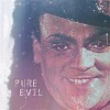
022: The Public Enemy
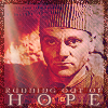
030: Each Dawn I Die
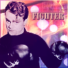
035: The Irish in Us
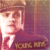
040: candid still
044: Taxi!
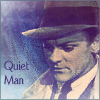
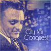
060: City for Conquest
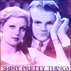
080: Taxi! (with Loretta Young)
083: The Roaring Twenties
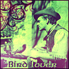
085: A Midsummer Night's Dream (with pigeons)
086: The Strawberry Blonde (with Olivia de Havilland)
If you enjoy my work and would like to show appreciation for it, I welcome tips in the form of Dreamwidth Points. (Enter my username "jordannamorgan" as the account you're buying for.)
Please comment and credit. Do not alter without permission. Do not hotlink.
| 022. Evil | 030. Hope | 035. Fight | 040. Mystery | 044. Young |
 |
 |
 |
 |
 |
| 060. City | 080. Pretty | 083. Fall | 085. Animal | 086. Beauty |
 |
 |
 |
 |
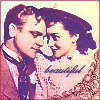 |
Image Sources:
022: The Public Enemy
030: Each Dawn I Die
035: The Irish in Us
040: candid still
044: Taxi!
060: City for Conquest
080: Taxi! (with Loretta Young)
083: The Roaring Twenties
085: A Midsummer Night's Dream (with pigeons)
086: The Strawberry Blonde (with Olivia de Havilland)
If you enjoy my work and would like to show appreciation for it, I welcome tips in the form of Dreamwidth Points. (Enter my username "jordannamorgan" as the account you're buying for.)
no subject
no subject
no subject
And I seriously covet the hat which he wears for Bottom, I do.
no subject
Re the hat: you and me both. *g* It's on my Coveted Movie Hats list, along with his "Roaring Twenties" nautical cap and, of course, The Danny's jester hat.
no subject
And Fall is amazing. I absolutely adore literary or scriptural captions anyway, and the pic and coloring are amazing anyway.
Mystery and Beauty are favorites, too.
no subject
That's the exceptional visual crafting of "The Public Enemy". The credit goes to the cinematographers (and Jael the screencapper)--not me.
No solid ideas came to me for an icon of fall as a season, so I went for its meaning as a verb instead, and colored it autumnally for good measure. The caption is really an exact reflection of that point in the movie.
I had the hardest time deciding what to do with Mystery, since I don't think Jimmy actually did any mystery films per se. That shot came to mind as representing his quiet, enigmatic nature in real life. I was hesitant to use it because I'd already done a popular icon with that picture, but I'm happy with how it turned out.
no subject
That reminds me of a quote about humility; I think by C.S. Lewis, possibly in Screwtape, but I can't swear to it. To badly paraphrase: "True humility is to admire and praise a great work you yourself created just as much as if someone else had done it instead." That's really helped me put into perspective stuff I've been praised for. :) (End digression.)
It's fascinating to learn how your icon-creation process works. I think Mystery turned out really well and really its own creation. The overall effect is appropriately mysterious, while the caption softens what could easily be too ominous and makes it more introspective. I like it very much.
no subject
Ha! I couldn't praise my own work... much. I can often feel that compared to others (i.e. the icontests), my icons are more *logical* and pleasing to one's sense of perspective and centering--but that's largely a matter of taste. I don't get it, but a lot of other people are nuts about icons that show someone from the chin down. As far as the technical level, I use such an old program (by choice) that I'm not sure there's much comparison.
I have always had a pretty good eye for composition and the framing of shots in photography. I think that's helped me in the cropping of my icons. Lately I have tried to do a bit of the slightly more off-center focus that's in vogue, but I never could do those icons that are just an eye or a mouth. :Þ
I could go on a lot about the thought processes that go into my icons, if not the techniques. I think you said something once about my icons being very specific in their meanings, and this is true. I take what I want the text and/or the image itself to express, and I build the icon on that, from coloring to font style. The choice of an underlying mood goes into every icon I make, and everything I add to it must contribute to that. Nothing is random.
no subject
And that's what comes of such a poor paraphrase. I know that 'praise' isn't in it, but couldn't come up with the right phrasing. What it's really addressing, of course, is the tendency of our culture to approximate humility by downplaying the achievement. I've seen you acknowledge praise quite gracefully, so no worries. :)
Perhaps it's a matter of taste for me as well. I've seen few icons that are arranged and framed as well as yours; your photography experience has absolutely a lot to do with it. There are icons out there, though, that are fairly well framed and and have text well-integrated. (These are often of costume dramas, which makes sense; people who are interested in costumes want to *see* the costumes, not a corner of a face.) They don't usually please me as much, however, because they clearly haven't spent as much time as you have. Your color skills have spoiled me rotten. *g* I'm just not satisfied with plain grey or sepia icons any more. :) And the textures and occasional, um, swirly things are marvelous.
What I'm trying to say is that your icons are extremely pleasing to the eye because of the thought and intent and resulting detail that goes into them. It's like reading a marvelous passage of prose, one so marvelous that it just sweeps you along with it, and you don't even think about the hours and painstaking effort that went into crafting each phrase and sentence.
There's a definition of art that involves making the difficult and arduous appear not only effortless but beautiful. That's the track you're on.
I... think I could force myself to read it if you bothered to write out your thought processes for your icons. Probably. *falls down in helpless laughter* I'd be riveted! There was a time, back when I had time, when I liked to do design layouts for poetry. I adored playing with those details of color and text and font and pictures to give just the exact nuance of meaning. I love stuff like that!
no subject
I've seen you acknowledge praise quite gracefully, so no worries.
Just another part of my policy of honesty, I suppose! I'm forthright about my opinion of my own work--and other people's.
What's funny is, half the time I don't even plan to colorize those occasional icons that look like they were in color to begin with. I'll just be doing different things with color layers, realize it's taken on a natural sort of hue, and decide to help it along. Ironically these always turn out better than my intentional colorizing.
The time it takes me to make an icon varies greatly, depending on what I do to it. They can take a few minutes or an hour. Choosing just the right font actually takes some time (I have about two thousand of them)--but it's a very important step for me, because it says so much about the "mood" I mentioned.
I've gotten curious about how much time other people put into it, because so many icons these days look like the creator cropped it with their eyes closed and just slapped a light texture or some text on it. I wonder now how much more effort they put into adjusting the coloring (not that I find their icons any more attractive). Of course, if I found out these people *were* making five-minute icons and winning all the icontests with them, I would be... fairly disgusted. :Þ
It was getting to be a challenge finding different things to do with the Cagney 100. I have basically three elements to work with: color, light/texturing, and font/decoration. I felt sometimes like I was hitting a limit on the variations I could achieve with those three aspects.